Human potential.
Elevated.
A considered identity for a business built on expertise, opportunity, and human connection.
The identity
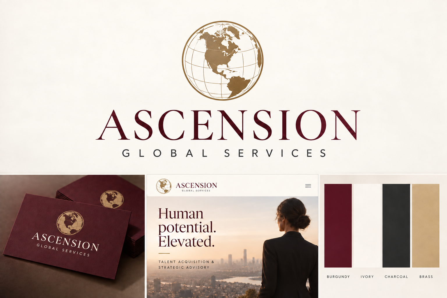
A brass globe with the United States prominently centered pairs with a refined serif wordmark. Recognizable continents give the symbol a clear global character. The typography brings composure and authority; the warm palette keeps the experience personal.
 ASCENSIONGLOBAL SERVICES
The palette
Burgundy#561D32
Primary brand color
Ivory#F7F3ED
Warm open space
Charcoal#242326
Readable body text
Brass#B69B6C
Logo and subtle accents
Typography and voice
A thoughtful perspective.
Refined serif headlines, balanced spacing, and selective italics create an editorial character. The wordmark uses uppercase lettering and generous spacing.
Clear. Personal. Direct.
Readable body text supports concise, specific messages. Explain the work, ask useful questions, and let genuine expertise carry the conversation.
A consistent experience
Use ivory backgrounds, burgundy headlines and primary buttons, thin brass rules, and generous space. Photography should show people in a professional context. Motion is restrained: content rises gently into view, navigation responds clearly, and essential content remains available with reduced motion enabled.
Logo use
Keep the globe upright and the United States prominent. Preserve clear space around the full logo. Use the globe alone at small sizes. The standard wordmark is burgundy on ivory or white. Do not stretch, rotate, add gradients, or combine the emblem with extra symbols.